FinTech · B2C + B2B
Crowdfunding for eco projects
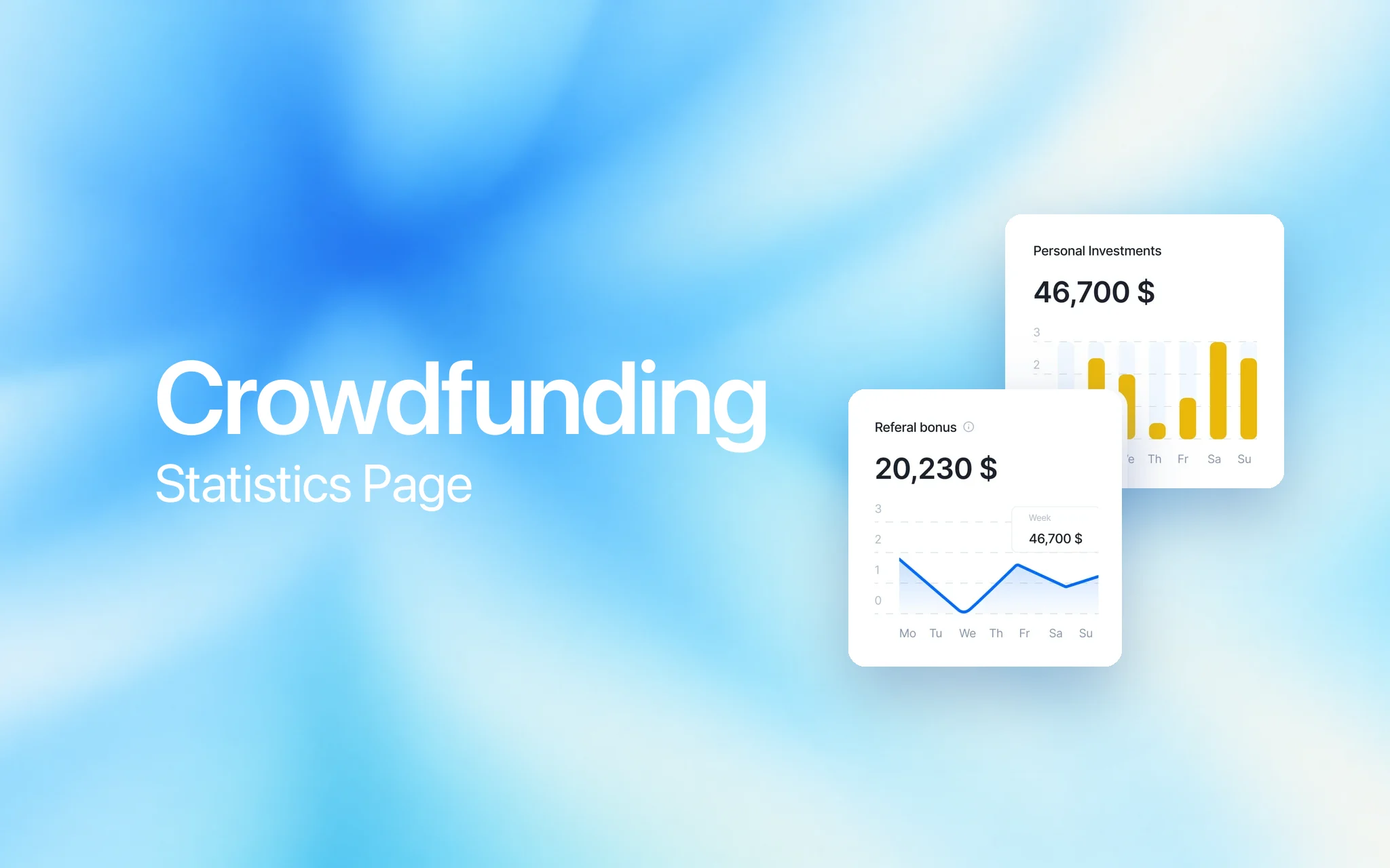
Redesign of the statistics section in the investor's dashboard of an international crowdfunding platform that channels private investment into ecological projects, from clean water and soil to green technology, so that a healthier planet and healthier people become one investment goal.
Role
Senior Product Designer
Research
In-depth interviews, CJM
Scope
Statistics section, responsive
Year
2023 — 2025
About
Investing in projects that help nature
An international crowdfunding platform where private investors back ecological projects: land restoration, clean water, organic farming, green technology. The idea is that ecology and health are one system, so money that helps nature also pays back in people's wellbeing.
Investors build partner structures and referral lines, and the Statistics section of the investor's dashboard is where they track them.
My task: redesign the statistics section in the investor's dashboard with a partner structure model.


Problem
Overloaded, hard to navigate, off its goals
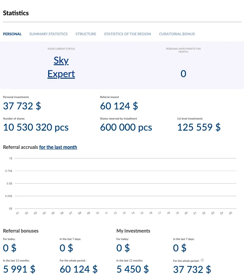
The original statistics section was overloaded, hard to navigate, and difficult for users to understand. It failed to support the main goals of partner-investors, such as tracking their structure, line statuses, line contacts, investments, and personal performance. The page was not meeting its business objectives.
Solution
An interactive dashboard with a clear, modular layout
Interviews first, then a journey map
To better understand user behavior and pain points, we conducted in-depth interviews with active participants of the platform. Based on the collected qualitative insights, we mapped out a Customer Journey Model (CJM) that reflects real user actions, goals, and frustrations across different usage stages.
This CJM became the foundation for identifying redesign opportunities and prioritizing improvements on the statistics page.
| Stage | User goal | Actions | Pain points | Opportunities |
|---|---|---|---|---|
| 1. Entering the statistics section | Check the structure, see key participants | Opens the section, compares metrics, searches for filters | Data is displayed in a single line; no highlighting of “experts”; the site isn't always stable | Visualize the structure; highlight roles and statuses; improve site reliability |
| 2. Analyzing the structure | Understand who is active, who registered, who invested | Compares personal and structural turnover, registrations, first investments | Cannot see the full structure; hard to understand when someone started investing | Add filters by year, status, registration; integrate with external tools |
| 3. Using filters | Find a specific person, check their activity | Searches by name, date, activity | Can't tell how many years someone has been in the structure; filters are inconvenient | Expand filters: by entry year, activity level, team |
| 4. Notes and data export | Save important information, track growth | Writes manually in a notebook, on Telegram, etc. | No built-in notes feature; cannot highlight key information | Add in-app note-taking; allow export and download |
| 5. Motivation and actions after analysis | Draw conclusions, make decisions | Evaluates efficiency, decides on training or promotion | No button to contact a person; hard to understand motivation and engagement | Add a “message” button; integrate with training or notification tools |
Solution
An interactive dashboard with a clear, modular layout
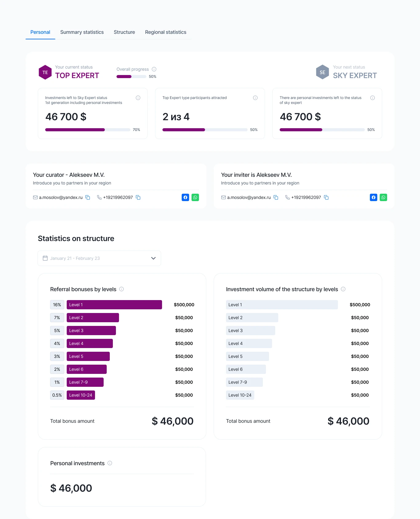
A full redesign with a strategic rethinking of the entire Statistics section: key metrics grouped into personal status, referral progress and structure stats; progress bars for goal completion; consistent typography and spacing; a date filter for dynamic structure analysis — responsive for desktop, tablet and mobile.
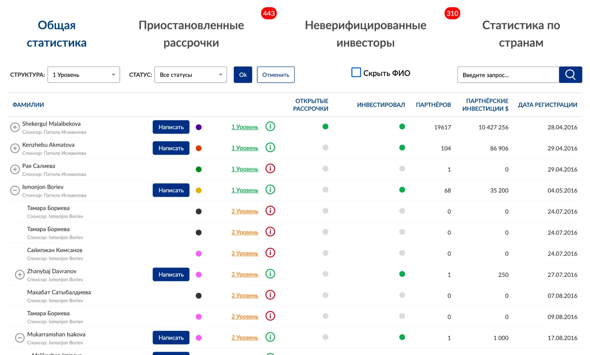
Summary statistics before: the partner table, as it was.
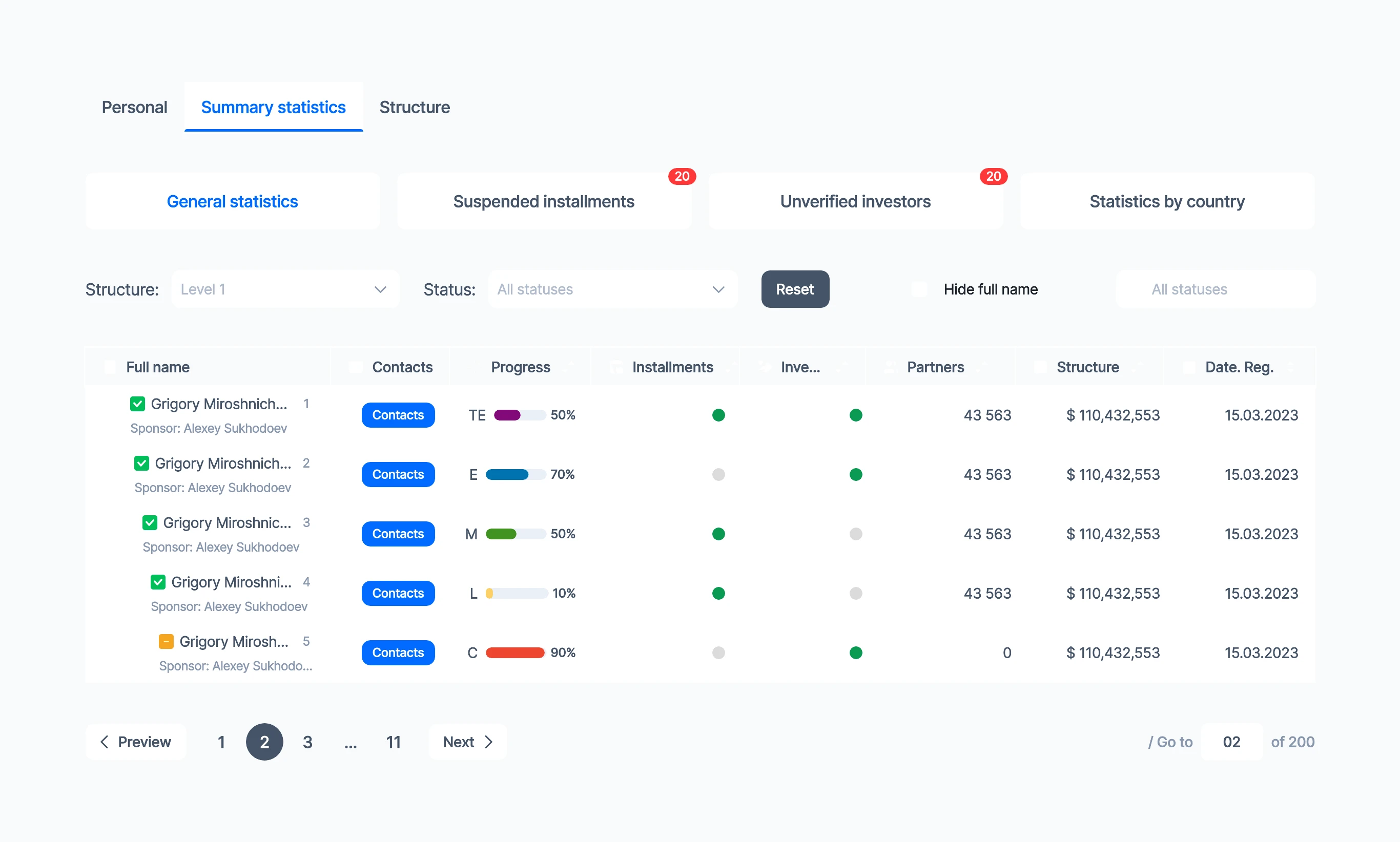
Summary statistics after. The issues with visual hierarchy and overall structure were addressed; instead of a cluttered set of packages and coupons, a streamlined, clearly structured example block was introduced; a simple verification block guides users through the process.
CTA in the statistics section up 44%
According to Yandex.Metrica, bounce rate decreased and task success rate improved. I closely collaborated with product managers and analysts to continuously monitor key metrics and validate the impact of the redesign through both qualitative and quantitative data.
Before and after the redesign
| Metric | Before redesign | After redesign |
|---|---|---|
| DAU (daily active users) | 550–650 users | 900–1,050 users |
| MAU (monthly active users) | 3,000–3,200 users | 4,800–5,200 users |
| Referral rate | 6.5% | 9–10% |
| K-factor | 0.75 | 0.95–1.0 |
| Activation rate | 48% | 70% |
These results confirmed that the redesign effectively addressed both user needs and business objectives.
+44%
CTA in the statistics section, Yandex.Metrica
48% → 70%
Activation rate
0.75 → 1.0
K-factor